In this tutorial, we’ll go over how to quickly make an effective blog title image. The technique outlined here is how we do it for our blog. The last step in the process might be the most valuable, but every step counts.
Content marketing drives your business forward. Call us at (443) 475-0787 or Contact Us online.
Step 1: Find An Image

potter at work
If you’re tight on cash, you can search Creative Commons for free images approved for commercial use. Depending on your business, this might not be too hard. However, if you find yourself spending hours looking for the right image, it might be worth getting a stock image account. Try Depositphotos, iStock, or 123RF.
We’re not going to go into what makes a good image. Decide for yourself, and if you’re not sure, ask a friend.
Step 2: Add Title And URL
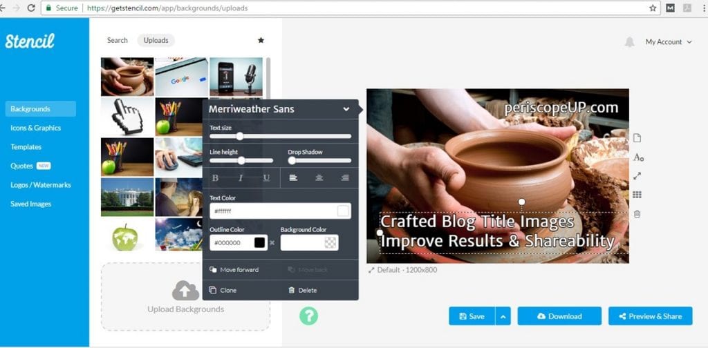
Once you’ve decided on your image, add in the blog title and your website address. This makes your image 100% original. Plus, if it happens to get shared, your website address gets shared too. There are online tools (we use Stencil) that make this process very easy. If you want to get fancy, you can use graphic design software to do this as well. You can even use PowerPoint.
Step 3: Add Image To Blog Post
Now you can add your image to the blog post. In WordPress, you should make it your Featured Image. Be sure to fill in the alt text for the image to make it SEO friendly. Reduce the image size if it’s too large. You want to visitors to see that a written blog post is why they landed here in the first place.
Step 4: Added Image Value
Ogilvy & Mather are advertising giants that have created around $1.5 billion worth of ads. Plus they spent $4.9 million tracking results. What do they tell us about images? They tell us the caption under the image is critical. The O&M research concluded that twice as many people read the caption under a photo as read the body copy. Also, each caption should strive to include your brand name and a promise – just like ours does for this post.
Here’s the full O&M sheet “How to create advertising that sells“. Read it. It’s a gold mine of advice.
Odds & Ends
Remember shareability is key. Very complex images look bad on social sharing. Plus, they’re hard to see on mobile. Try to think about where users might encounter your image. Just because your picture looks awesome on your wall sized design monitor, it might not be so great on a smartphone screen.
Ogilvy & Mather say that every picture should tell a story. With practice, you’ll get better at picking the right image for your blog title and adapting it for better marketing results.
Want superior blog posts for your brand? Call us at (443) 475-0787 or Contact Us online.
