Optimizing your landing page (the page within your site where a user “lands” when they arrive at your site) is an easy way to decrease your marketing costs. This post walks through a recent landing page optimization we’ve done for a client, Baltimore Technology Park. It explains how we improved the landing pages with strong calls to action.
How can changing your website’s landing page lower marketing costs?
Think of it this way. As a simple illustration, you’re spending $1,000 per month with search advertising and getting 1,000 people to visit your site, and let’s say 1% of them contact you. That’s 10 leads per month, costing you $100 per lead. Now, to increase the number of leads next month, you could increase your advertising spend, buying more visitors, or you could increase the effectiveness of your landing page. Let’s say you can figure out how to get 20 people to contact you instead of 10 from that same landing page. Your new conversion rate (2%) equates to 200 leads, each costing only $50.
There’s a ton written about this overlooked concept, notably by Tim Ash, author of Landing Page Optimization: The Definitive Guide to Testing and Tuning for Conversions. He goes into tremendous detail in his book, and while I recommend the read, we try to keep things simpler.
Here’s an example of how you can optimize your landing page.
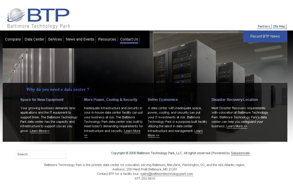
First, here’s the old homepage for Baltimore Technology Park’s website. They sell colocation and data room services, and we’re managing their PPC and SEO campaigns.
We see many sites like this: strong imagery, good navigation, fast load-times, standards compliant (in other words, technically strong), but with poor use of copy. The writing is one of the most important parts of a web site (both search engines and people rely on it !), yet it’s the most difficult part to get right.
Many design firms leave the copy up to the client to write, because the client knows their business better than the designers and programmers. If you want your site to be more than brochure ware, more than just informational about you, it has to work to a specific purpose.
What’s your purpose?
Well, that’s up to you, but in this case it’s to get the user to contact BTP, so BTP can sell them their colocation and data room services. Yet, nowhere does this page tell users what to do next. Do we just presume the user is so blown away by the amazing website, they’ll dig for a phone number and not give up until they’ve dialed ?
So we worked with Baltimore Technology Park to determine the action they wanted users to take while visiting the site, and an offer they could use to entice that action. One of their strongest selling tactics is a free facility tour. Perfect. It will get the user to become prospect and won’t cost anything.
Next we identified the following areas for improvement:
- We decided to put the call to action in this otherwise wasted space. Images are fantastic for setting concepts and the look and feed for a site, but rarely do they compel action.
- If you work with us, you’ll hear us speak about the concept of harmony, the way Hu Jintao might. We removed this line. It was clutter that didn’t serve the purpose we are now focusing on, getting the user to call.
- What was 3?
- This text was too small to read. People don’t read on the web anyway, they scan. We made this text scanable (plus we optimized the links for SEO).
- See #4
- See #5
- See #6.
- This is the company’s value proposition. Why bury it in the footer? Bring it up to the top, which is better for SEO. We did want to maintain that good use of white space in the design.
- This became the footer
- We made the contact information a little easier to read.
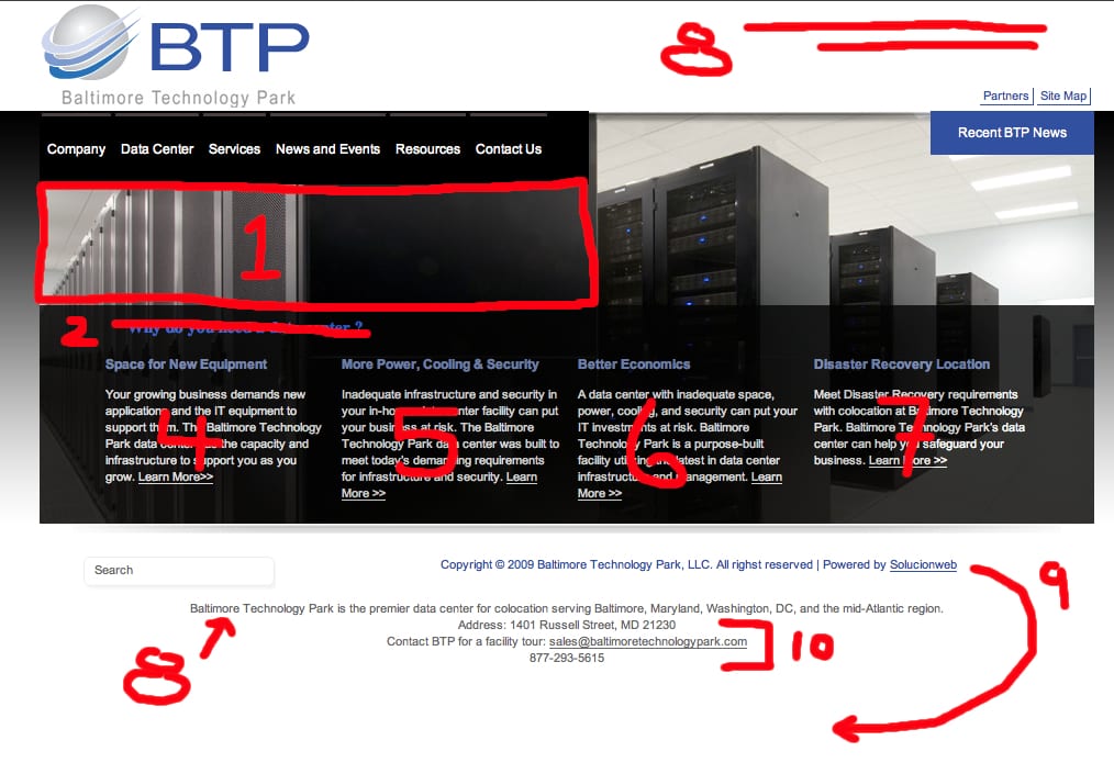
Here are the changes we suggested to Baltimore Technology Park, to make their landing page work harder. Click the image to enlarge.
We then had the web team implement the changes, adding a little flash movie to grab some eyeballs. All of the other changes were text based and only took the web team a few hours to implement.
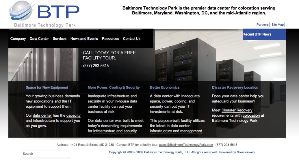
Here’s the Finished Next Version
This landing page has the company’s Unique Selling Proposition at the top, a strong call to action in the middle of the page, and larger, easier to read text. Plus it’s better optimized for search engines!
What’s Next?
Guiding all our optimization efforts is the underlying knowledge that if you get better and better month after month, you’ll get better and better. Very few companies do this; most just set it and forget it. Only by competing against yourself will you blow your competition away.
We’ve got Google Analytics installed on their website, so we can establish this revision as the baseline. We’ll let it work for a month, so as to collect data, but that’s just the beginning.
Our next step will be to provide automated multivariate testing over the next few months to maximize the conversions (but that’s the stuff of another post).
If you want to learn more about landing page optimization, give us a call: (443) 845-7724. How’s that for a call to action?
